 esigning is one of the pleasures of my life, along with eating, which is my favorite sport. I have a master's degree in ceramic sculpture, and have taken about 18 semester credits in design. All of my design, like virtually all design in the tail-end of the 20th century, is done on the computer, and for this I use a complete desk top publishing system, centered around a Power Mac with a 20" monitor. esigning is one of the pleasures of my life, along with eating, which is my favorite sport. I have a master's degree in ceramic sculpture, and have taken about 18 semester credits in design. All of my design, like virtually all design in the tail-end of the 20th century, is done on the computer, and for this I use a complete desk top publishing system, centered around a Power Mac with a 20" monitor.
| My software package is the "Big Three," Adobe Illustrator and Photoshop, and QuarkXPress. Although I am using Photoshop more and more because of my work on the Web, my heart belongs to Illustrator, and this is what I use for posters and logos, which are my favorite design problems. Color is one of my interests, and I often adjust colors down to a few percentage points. Most of my designing is for Korea TESOL, the Pacific-Asian Conference, and Jeonju University.
|
|
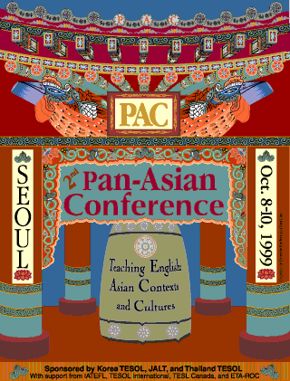
 eoul is the site of the Pacific-Asian Conference for 1999. The poster for the Bangkok conference used the image of a Thai Buddhist scupture (see below), and for the Seoul poster I wanted strong Korean images. The Adobe Illustrator work is based on a small temple near my home. I "recycled" some of the images on the "splash page" for this Web site. eoul is the site of the Pacific-Asian Conference for 1999. The poster for the Bangkok conference used the image of a Thai Buddhist scupture (see below), and for the Seoul poster I wanted strong Korean images. The Adobe Illustrator work is based on a small temple near my home. I "recycled" some of the images on the "splash page" for this Web site.
(Theme: "Teaching English: Asian Contexts and Cultures.")
|
|
|
|
|
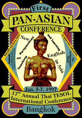
 angkok was the site of the first Pacific-Asian Conference. This poster required three programs to produce, all by Adobe: Illustrator, Photoshop, and Streamline. In addition to color, fonts and their placement are also important in my work, and I often adjust the letters by a millimeter or two. Coming as I do from a background of paper publishing, with its high resolution, millions of colors, and control of placement, it is as times frustrating to work on the Web, with its 216 colors, low resolution, and a placement system that resembles tossing coins onto a game board. angkok was the site of the first Pacific-Asian Conference. This poster required three programs to produce, all by Adobe: Illustrator, Photoshop, and Streamline. In addition to color, fonts and their placement are also important in my work, and I often adjust the letters by a millimeter or two. Coming as I do from a background of paper publishing, with its high resolution, millions of colors, and control of placement, it is as times frustrating to work on the Web, with its 216 colors, low resolution, and a placement system that resembles tossing coins onto a game board.
(Theme: "New Perspectives on teaching and learning English in Asia" I "chewed up" the type in the center so it would look as old as the sculpture.) |
 |
| |
|
 |
esigners, like composers who write fugues, work under heavy constraints. For my posters, I am given a theme, and the poster must bring across this theme with vigor. However, a basic rule of design is that your first idea is probably not going to be a good one, in that it will likely be too obvious. If, say, you are given a theme concerning something "international," the first thing that may come to mind is a globe. However a few billion other people would also come up with this idea, so throw it away. As you dig deeper and deeper into the idea, you can also toss away the second and third idea, and eventually come to asolution you feel good about.
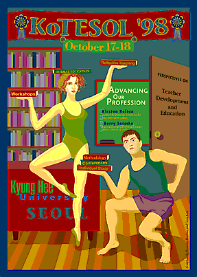
(Theme: "Advancing our profession: Perspectives on teacher development and education" I downloaded Web images of female dancers, including ballet and traditional Indian dancers, to get a feel for the woman. I myself posed for a photograph sitting on a stool, wearing shorts and holding three books.) |
|
|
|
|
 very solution to a design problem should relate to the theme, but not too directly. If you approach the theme at an oblique angle, the result may be a poster that is satisfying on the first or the tenth viewing. It is often difficult to explain why a really good poster works so well. very solution to a design problem should relate to the theme, but not too directly. If you approach the theme at an oblique angle, the result may be a poster that is satisfying on the first or the tenth viewing. It is often difficult to explain why a really good poster works so well.
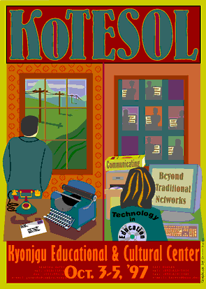
(Theme: "Communicating beyond traditional networks" For this I wanted a feeling of boredom, even loneliness, for the man waiting for a phone call or a letter. And I wanted the hustle and bustle of us moderns who are hooked into the World Wide Web. Although I do admit that at times I long for those mare liesurely days when letters came once a day.
) |
|
|
|
|
|  rovincial design companies outside Seoul rarely hire design majors, so much of their design looks like a pile of images were put into a blender and then poured onto a page. Each element of a poster needs both a content and a compositional reason for existing, and all the details, including the placement, the color, and the type, need to be attended to. An example: a designer should accomodate a design to a photo, not accomodate the photo to the design. How can a designer take a photo of a shapely woman and turn her into a starving refuge or an Eastern European weight lifter, just to fit the image into a space? rovincial design companies outside Seoul rarely hire design majors, so much of their design looks like a pile of images were put into a blender and then poured onto a page. Each element of a poster needs both a content and a compositional reason for existing, and all the details, including the placement, the color, and the type, need to be attended to. An example: a designer should accomodate a design to a photo, not accomodate the photo to the design. How can a designer take a photo of a shapely woman and turn her into a starving refuge or an Eastern European weight lifter, just to fit the image into a space?
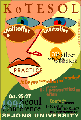
(Theme:
"Reflecting on practice." This poster makes use of type, with each letter carefully chosen, colored and placed. It also contains images familar to English teachers: dictionary entries and cliched textbook layouts of questions and answers, and of substitutions. The poster has a playfull touch, as in the reversal of "reflection" in the glasses, and the placement of "practice" on the mouth. Notice that although the words of the theme appear often, the theme itself never appears.) |
|
|
|
|
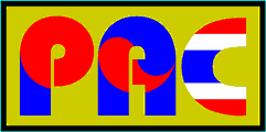
 ogos should be simple but striking. This Pacific-Asian Conference logo is based on the font Bauhaus Heavy and the flags for the three countries sponsoring the conference, Japan, Korea, and Thailand. ogos should be simple but striking. This Pacific-Asian Conference logo is based on the font Bauhaus Heavy and the flags for the three countries sponsoring the conference, Japan, Korea, and Thailand.
|
  
 |
|
|
|
 |
 eversing a stylized upper-case "E" gives the arrowhead of this arrow, the logo for the English Education Department at Jeonju University. eversing a stylized upper-case "E" gives the arrowhead of this arrow, the logo for the English Education Department at Jeonju University.
|
|
|
|